 HarmonyOS應用開發—popup氣泡指示組件練習
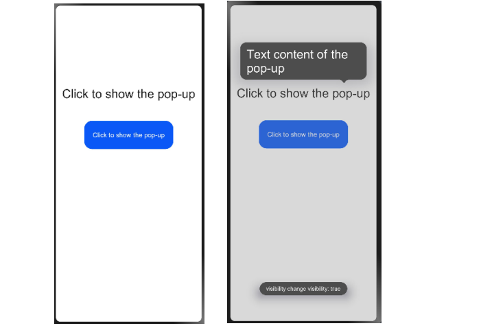
效果展示:
說明:
該組件從API version 4開始支持。后續版本如有新增內容,則采用上角標單獨標記該內容的起始版本。
氣泡指示。在點擊綁定的控件后會彈出相應的氣泡提示來引導用戶進行操作。
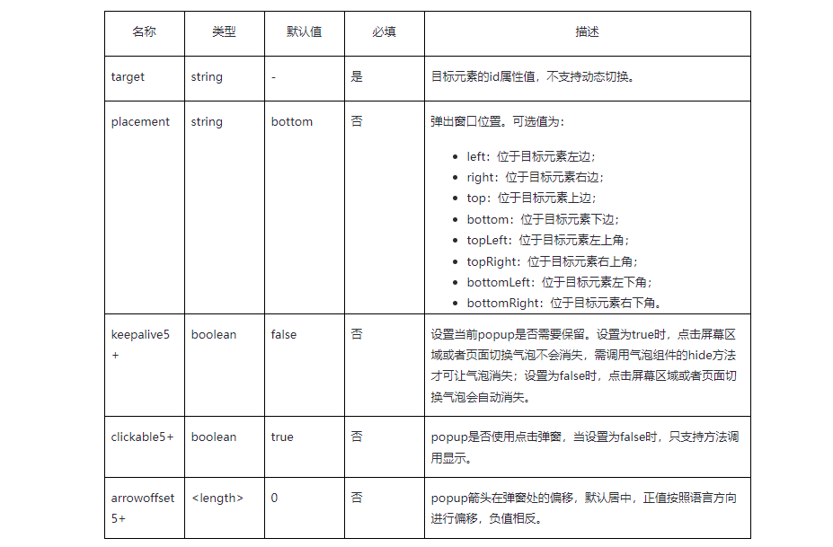
屬性:
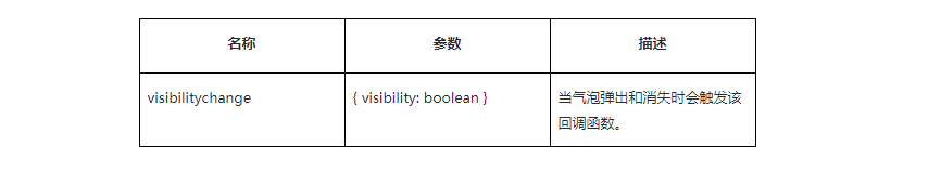
事件:
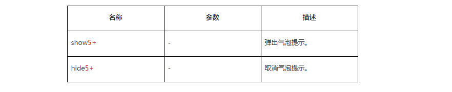
方法:
說明:
1.popup氣泡彈窗屬性、樣式均不支持動態更新。
2.popup氣泡彈窗的margin樣式是相對于target元素進行生效的,如popup在target元素下方,此時只生效margin-top樣式,popup在target元素左上方,此時只生效margin-bottom和margin-right樣式。
3.popup的border四邊樣式需一致,若四邊設置不一致且圓角為零,則按左、上、右、下的順序取第一個被設置的樣式,否則border不生效。
4.popup的target組件的click事件不生效。
代碼示例:
Click to show the pop-upText content of the pop-upClick to show the pop-up
/* xxx.css */
.container {
    flex-direction: column;
    align-items: center;
    padding-top: 200px;
}
.popup {
    mask-color: gray;
}
.text {
    color: white;
}
.button {
    width: 220px;
    height: 70px;
    margin-top: 50px;
}
// xxx.js
import prompt from '@system.prompt'
export default {
    visibilitychange(e) {
        prompt.showToast({
            message: 'visibility change visibility: ' + e.visibility,
            duration: 3000,
        });
    },
    showpopup() {
        this.$element("popup").show();
    },
    hidepopup() {
        this.$element("popup").hide();
    },
}

審核編輯:符乾江
聲明:本文內容及配圖由入駐作者撰寫或者入駐合作網站授權轉載。文章觀點僅代表作者本人,不代表電子發燒友網立場。文章及其配圖僅供工程師學習之用,如有內容侵權或者其他違規問題,請聯系本站處理。
舉報投訴
-
Popup
+關注
關注
0文章
5瀏覽量
1389 -
HarmonyOS
+關注
關注
80文章
2057瀏覽量
32221
發布評論請先 登錄
相關推薦
熱點推薦
HarmonyOS開發案例:【常用組件與布局】
HarmonyOS ArkUI提供了豐富多樣的UI組件,您可以使用這些組件輕松地編寫出更加豐富、漂亮的界面。

【HarmonyOS】組件開發指南
HarmonyOS軟件以組件(bundel)作為基本單元,從系統角度看,凡是運行在HarmonyOS上的軟件都可以定義為組件;一般來講,根據組件
發表于 09-18 17:14
鴻蒙應用開發JS-Popup氣泡提示體驗
`Popup是氣泡指示。在點擊綁定的控件后會彈出相應的氣泡提示來引導用戶進行操作,下面通過案例來演示效果。顯示效果: 點擊“popup” H
發表于 04-18 11:12
HarmonyOS應用開發-三方UI線程圖組件練習
HarmonyOS已陸續推出1000+組件,包含UI、動畫圖形、框架、安全、工具、網絡、文件數據、多媒體、圖片緩存和基礎功能,具有多設備形態可用、多端部署、性能優化三大特點。使用組件可以快速進行項目
發表于 10-23 11:13
HarmonyOS組件更新,新增700+開源組件
組件是對數據和方法的簡單封裝,通過使用現成的組件讓應用開發更加簡單高效。自HarmonyOS組件開源以來,經兩次上線,已開源了700+的Ja
發表于 11-18 11:17
HarmonyOS應用開發資料(Svg組件)
1、HarmonyOS應用開發-Svg組件circle 該組件從API version 7開始支持。后續版本如有新增內容,則采用上角標單獨標記該內容的起始版本。2、
發表于 03-17 14:49
【組件資料】HarmonyOS三方件開發指南
1、HarmonyOS三方件開發指南——LoadingView組件1.LoadingView組件功能介紹1.1.功能介紹:LoadingView組件
發表于 03-21 11:18
HarmonyOS應用開發-popup氣泡指示組件練習
效果展示: 說明:該組件從API version 4開始支持。后續版本如有新增內容,則采用上角標單獨標記該內容的起始版本。氣泡指示。在點擊綁定的控件后會彈出相應的氣泡提示來引導用戶進行
發表于 04-02 11:09
HarmonyOS popup氣泡指示組件的操作方法
效果展示:說明:該組件從API version 4開始支持。后續版本如有新增內容,則采用上角標單獨標記該內容的起始版本。氣泡指示。在點擊綁定的控件后會彈出相應的氣泡提示來引導用戶進行操
發表于 04-02 11:31
HarmonyOS鴻蒙原生應用開發設計- 服務組件庫
HarmonyOS設計文檔中,為大家提供了一些已經設計好的原生服務組件庫,開發者可以根據需要直接引用。
開發者直接使用官方提供的服務組件庫樣
發表于 10-24 16:12
華為開發者HarmonyOS零基礎入門:UI組件設計開發實踐
華為開發者HarmonyOS零基礎入門:UI組件設計開發實踐之圖庫應用介紹,應用數據加載顯示模型圖片加載渲染功能快速在其他應用上。

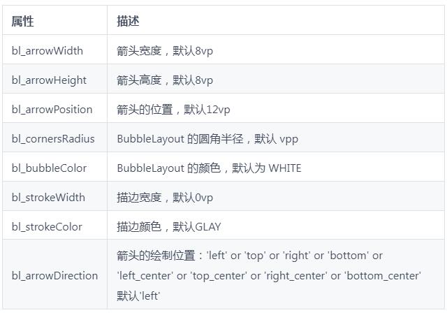
用于openharmony的氣泡組件
用于openharmony的氣泡組件,具有自定義筆劃寬度和顏色、箭頭大小、位置和方向。BubbleLayout 擴展了 StackLayout。 屬性 您可以設置幾個屬性:
發表于 03-22 09:55
?2次下載
OHOS中實現各個方向的氣泡彈窗案例
項目介紹 實現各個方向的氣泡彈窗,可控制氣泡尖角偏移量 安裝教程 在entry的build.gradle中添加依賴 依賴項 { ... 實施 ‘com.gitee.archermind-ti:bubble-popup-windo
發表于 03-25 13:44
?2次下載


 工商網監
工商網監
評論