 電子發(fā)燒友App


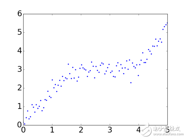
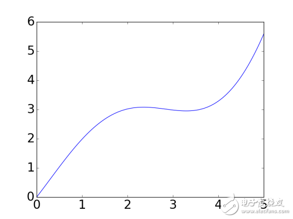
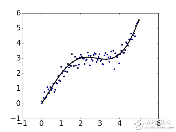
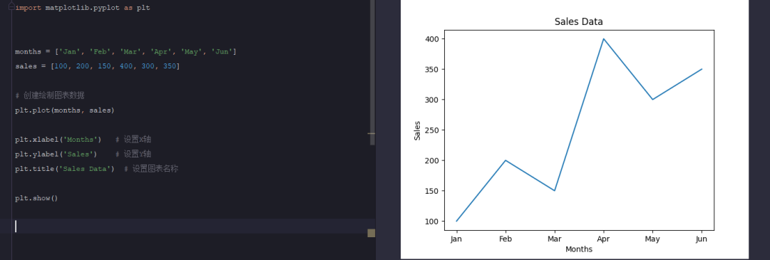
Matplotlib中最基礎(chǔ)的模塊是pyplot。先從最簡單的點(diǎn)圖和線圖開始,比如我們有一組數(shù)據(jù),還有一個(gè)擬合模型,通過下面的代碼圖來可視化:
import numpy as np
import matplotlib as mpl
import matplotlib.pyplot as plt
# 通過rcParams設(shè)置全局橫縱軸字體大小
mpl.rcParams['xtick.labelsize'] = 24
mpl.rcParams['ytick.labelsize'] = 24
np.random.seed(42)
# x軸的采樣點(diǎn)
x = np.linspace(0, 5, 100)
# 通過下面曲線加上噪聲生成數(shù)據(jù),所以擬合模型就用y了……
y = 2*np.sin(x) + 0.3*x**2
y_data = y + np.random.normal(scale=0.3, size=100)
# figure()指定圖表名稱
plt.figure('data')
# '.'標(biāo)明畫散點(diǎn)圖,每個(gè)散點(diǎn)的形狀是個(gè)圓
plt.plot(x, y_data, '.')
# 畫模型的圖,plot函數(shù)默認(rèn)畫連線圖
plt.figure('model')
plt.plot(x, y)
# 兩個(gè)圖畫一起
plt.figure('data & model')
# 通過'k'指定線的顏色,lw指定線的寬度
# 第三個(gè)參數(shù)除了顏色也可以指定線形,比如'r--'表示紅色虛線
# 更多屬性可以參考官網(wǎng):
plt.plot(x, y, 'k', lw=3)
# scatter可以更容易地生成散點(diǎn)圖
plt.scatter(x, y_data)
# 將當(dāng)前figure的圖保存到文件result.png
plt.savefig('result.png')
# 一定要加上這句才能讓畫好的圖顯示在屏幕上
plt.show()
matplotlib和pyplot的慣用別名分別是mpl和plt,上面代碼生成的圖像如下:
基本的畫圖方法就是這么簡單,如果想了解更多pyplot的屬性和方法來畫出風(fēng)格多樣的圖像,可以參考官網(wǎng):
pyplot - Matplotlib 1.5.3 documentation
Customizing matplotlib
點(diǎn)和線圖表只是最基本的用法,有的時(shí)候我們獲取了分組數(shù)據(jù)要做對(duì)比,柱狀或餅狀類型的圖或許更合適:
import numpy as np
import matplotlib as mpl
import matplotlib.pyplot as plt
mpl.rcParams['axes.titlesize'] = 20
mpl.rcParams['xtick.labelsize'] = 16
mpl.rcParams['ytick.labelsize'] = 16
mpl.rcParams['axes.labelsize'] = 16
mpl.rcParams['xtick.major.size'] = 0
mpl.rcParams['ytick.major.size'] = 0
# 包含了狗,貓和獵豹的最高奔跑速度,還有對(duì)應(yīng)的可視化顏色
speed_map = {
'dog': (48, '#7199cf'),
'cat': (45, '#4fc4aa'),
'cheetah': (120, '#e1a7a2')
}
# 整體圖的標(biāo)題
fig = plt.figure('Bar chart & Pie chart')
# 在整張圖上加入一個(gè)子圖,121的意思是在一個(gè)1行2列的子圖中的第一張
ax = fig.add_subplot(121)
ax.set_title('Running speed - bar chart')
# 生成x軸每個(gè)元素的位置
xticks = np.arange(3)
# 定義柱狀圖每個(gè)柱的寬度
bar_width = 0.5
# 動(dòng)物名稱
animals = speed_map.keys()
# 奔跑速度
speeds = [x[0] for x in speed_map.values()]
# 對(duì)應(yīng)顏色
colors = [x[1] for x in speed_map.values()]
# 畫柱狀圖,橫軸是動(dòng)物標(biāo)簽的位置,縱軸是速度,定義柱的寬度,同時(shí)設(shè)置柱的邊緣為透明
bars = ax.bar(xticks, speeds, width=bar_width, edgecolor='none')
# 設(shè)置y軸的標(biāo)題
ax.set_ylabel('Speed(km/h)')
# x軸每個(gè)標(biāo)簽的具體位置,設(shè)置為每個(gè)柱的中央
ax.set_xticks(xticks+bar_width/2)
# 設(shè)置每個(gè)標(biāo)簽的名字
ax.set_xticklabels(animals)
# 設(shè)置x軸的范圍
ax.set_xlim([bar_width/2-0.5, 3-bar_width/2])
# 設(shè)置y軸的范圍
ax.set_ylim([0, 125])
# 給每個(gè)bar分配指定的顏色
for bar, color in zip(bars, colors):
bar.set_color(color)
# 在122位置加入新的圖
ax = fig.add_subplot(122)
ax.set_title('Running speed - pie chart')
# 生成同時(shí)包含名稱和速度的標(biāo)簽
labels = ['{}
{} km/h'.format(animal, speed) for animal, speed in zip(animals, speeds)]
# 畫餅狀圖,并指定標(biāo)簽和對(duì)應(yīng)顏色
ax.pie(speeds, labels=labels, colors=colors)
plt.show()


 工商網(wǎng)監(jiān)
評(píng)論